Saturday, July 26, 2008

Scrapbook Class

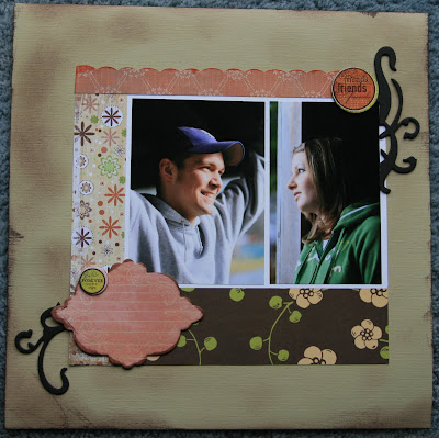
This is the "before" view of the page I worked on at the scrapbooking class today. The class example doesn't really look anything like this. (Yes, I'm a rebel!) I love the patterned paper and I wanted to use the whole sheet on one page. That's one of the things I love about the scrapbooking classes--everyone gets the same packet of paper and embellishments, but everyone's creations are totally different.


This chipboard swirl was stamped with some brown distress ink and then stamped with some light blue ink. The edges were "painted" with some copper Stickles (I think that's what it's called). I really love the way the copper-color looks on it. I would have never picked out that color on my own. I really like it!!


My friend Katrina was so sweet and let me use some of her letters. The class instructor, Nettie, had "things" in her title, so I followed her example. My friend Jamie was telling me about how Ali Edwards was saying something about starting with journaling first on a page, and so I think I'm going to challenge myself to do that with this page. I will journal first and then add the pictures. I'll post the "after" page soon!
Posted by Picasa

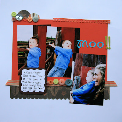
Random Moos!

The only thing Photoshop works well for in my life right now (without our newer computer) is editing and resizing photos. And even that takes lots of time and patience. Ha!


I snuck in green onto this page and I liked the way it looks. The orange color is one of the new In-Colors from SU called Tango Tangerine. Or is it Tangerine Tango? Hmmm...


This page was a lot of fun! The editing in Photoshop only took *yawn* (forever). Before I started I knew I wanted some scalloped frames around each picture. I wanted them to look worn. I have some digital frames that I use a lot in Photoshop, but since I didn't want to go that direction, I decided to make the frames myself. I'm so glad I kept the Fiskars scissors that I have. I used them back in my Creative Memories days and honestly thought I would never use them again.


I cut the heart out of some transparent folder thing and then painted the edges with pink acrylic paint. The small heart is cut from felt. And the last touch was the brown button.
Posted by Picasa

Woman to Woman

My friend Jamie forwarded me an e-mail with this encouragement. Jamie is the one who sparked my interest in digital scrapbooking. (Thank you!) I thought this encouragement fit so well with what I talk about on here.

Woman to Woman Encouragement

Someone will always be smarter. Their house will be bigger. They will drive a better car. Their children will do better in school. And their partners will fix more things around the house. So let it go and love you and your circumstances. Think about it. The prettiest woman in the world can have [wickedness] in her heart. And the most highly favored woman on your job may be unable to have children. The richest woman you know - she's got the car, the house, the clothes - might be heartbreakingly lonely. So, love you. Love who you are right now. Tell yourself, "I am too blessed to be stressed."

"To the world you might be one person, but to one person you just might be the world." Possibilities and miracles are one and the same.

Friday, July 25, 2008

Bubbles

This is a hybrid (regular + digital scrapbooking) page I did yesterday. I originally wanted to have the pictures on a background that I made using the technique that these pictures are about (the bubbles), but I didn't like the way it looked together.


Some pink flocking on a chipboard "4". I inked the chipboard with pink ink first and then added the flocking. It's really fun! Just like glitter, except for it's not shiny. I really need to remember when I am using this stuff not to blow on it...haha!


For the title I painted bubble wrap with pink acrylic paint and then stamped the letters onto the bubble wrap and then stamped onto my paper. So the bubble wrap became my ink pad. And the title was "Bubbles". Perfect! Ha!
Posted by Picasa

Thursday, July 24, 2008

Fabric

For some time now I have been wanting to scrap with fabric. I got these pieces of fabric from my grandmother. She probably had a quilt in mind, but I had a scrap page in mind. Ha!


These pieces have no rhyme or reason...and I like it that way. I wanted a messy, crazy look. The zig-zag stitches are so fun!

The picture and frame were matched up in Photoshop. The picture has a bit of a blur to it (Katie's face), but I love that action...to me it does something to the picture. I really tried to add some kind of background to this page, but I couldn't find anything I liked, so for now what you see is what you get. It's backed up to a page with a similar color in the page protector, so it looks ok like that.


This little embellishment was from this. I never think about making embellishments like that, and I totally love it! I embossed one of the Priceless flairs with clear embossing powder onto Cool Carribean (or was it Soft Sky?) paper, punched out a scallop, and then made slits. Next I added one of the pieces from SU's Hodgepodge Hardware kit. I was happy to find a way to use those because I don't use them that much.


I love all of these colors together!

Posted by Picasa

Pages & New Album


I was too lazy to take the pages out of the page protectors...


The center of this page was created in Photoshop, printed, and then I found some background patterned paper that matched it. I added a few buttons and now it's complete.


This layout will look familiar to those who have seen the cover of the August '08 Creating Keepsakes magazine. I really liked the colors together! The journal block was created in Photoshop, which was printed and cut out. The layers of paper were sewn. The chipboard flairs were painted pink and then stamped with SU Whisper White Craft ink with a paisley stamp. I really like how this page turned out!


My new scrapbook album. My sister-in-law, Jessica told me about these albums by We R Memory Keepers. I really liked the yellow one. I don't see a lot of yellow albums.
Posted by Picasa

Sunday, July 20, 2008

Tradition!

It looks like good ol' traditional scrapbooking will be coming in handy for the next couple of weeks. Our computer was having an issue...so it's back to the old computer for now. I have Photoshop on it, but there are a lot of disadvantages to using it on this old thing, so I'm going to do my best to stay clear of it. Ha! Plus it will be a good time to use up my traditional scrapbooking supplies.


I really like how the colors on this page came together and how perfectly the picture matches.


This page isn't finished. I will probably add a title and some journaling...eventually.
Posted by Picasa

Mikaela

I love to take the colors from a picture and use them in my layouts. When I saw SU's new color, Pacific Point, I knew right away that the shirt Mikaela was wearing in some of the pictures would match it almost perfectly.


Baroque Motifs was used for this layout...I just couldn't help myself. It's my new favorite stamp set! I stamped it onto the Pacific Point paper and then punched out the circles. I outlined the circles with a Chocolate Chip marker to make them stand out a little bit more. For some of the circles I wanted them to have a glossy look, so I put Crystal Effects on them. Stampin' dimensionals was used under each circle to have a 3-D look. I'd like to add one more thing to this page, but I'm not sure what it will be yet. I really like this picture of Mikaela.


Posted by Picasa

Cards, Cards, Cards

You could definitely say that I have been in the mood for stamping. It's been a lot of fun! I was motivated because I wanted to show my Stamper's 10 club members some cards using SU's In-Colors that will be retiring. I also wanted to show them some of the new In-Colors. The two sets that are shown a lot here are SU's Wanted and Baroque Motifs.
(Sorry about the dark pictures)


Above was used with Embrace Life and Doodle This. I was trying to water color on this card which was previously painted with gesso. I think I did ok for not really knowing what I was doing. Ha!

One of my new favorite things to do is to paint with an aqua painter using ink refills on watercolor paper. I just drop a tiny bit of ink onto a plate and then use the aqua painter. These are using some of the new In-Colors (Pacific Point, Kiwi Kiss, and Baja Breeze?).


Watercoloring on gesso cardstock.

Up close view of the one from above.

Two of the new In-Colors are shown here, but I don't remember the names of them.


This is one of my favorites! It's another where I used the ink refills and aqua painter.


Someone will be seeing this card very soon...


Posted by Picasa

Stamping Workshop Cards

The top two are the cards we made at the July stamping workshop for my stamping club.


Stamp Sets: Wanted and Priceless (SU)
Colors: Very Vanilla, Groovy Guava, Chocolate Chip (SU)
Other additions: staples, twill/hemp
Technique: masking, reverse masking


Stamp set: Baroque Motifs (SU)
Colors: Soft Sky, Chocolate Chip, Whisper White (SU)
Other additions: ribbon, brad


This is a card similar to the card above, but using SU's Priceless stamp set instead.


Same as the first card, except for the reverse masking.
Posted by Picasa

Wednesday, July 16, 2008