Wednesday, September 30, 2009

You make me smile

Sometimes a layout comes together easily...and sometimes it doesn't. This was one of those times where it wasn't coming along like I wanted it to. Tip: if you are spending HOURS on a layout and it's still not working out...it's time to start fresh! That's when I hit the beloved delete key and start over.


This was my first draft after LOTS of changes. I loved the circles, but I was really struggling with the color combination. I'm not a 'mauve' kind of person (or blue). I love the letters that spell 'smile', but they weren't working for me on this page. And then I felt like it was way too busy.


In my second draft I felt like I was surrendering. I really liked the journaling on the right side of the page though.


And for my third draft and the finale, I opened a new 12x12 document, moved some of the elements over from draft 2 and started over. Whew! I realized that I did not like working with the mauve and blue from my mom's shirt. (Next time she and I will have to coordinate on what colors are 'proper' to wear for scrapbooking...haha!) So I changed the picture to black & white and put a warming filter over that. There's also some texture on the picture...I hope it's not too much. And because it was March (winter) I thought it would be fun to add some snowflakes since I'm ready to scrap snowflakes again. I'm still not totally satisfied with this page, but I'm tempted to just leave it alone. (Walk away from the computer, walk away from the computer)

All of the supplies are from Little Dreamer.
Posted by Picasa

Tuesday, September 29, 2009

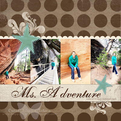
Ms. Adventure

Today was my first lesson with Adobe Illustrator. Whew! I got through the first lesson and I was like, "That's enough for me for one day!" I see a lot of potential with Illustrator and I'm excited!! I'm on the 30-day trial version, so I'll be spending as much time as possible learning what I can so I can make a decision. I tell you what, having some experience with Photoshop sure is helpful!


I created this page yesterday. I'm on the last part of our trip to Arizona as far as scrapbooking the pictures. I can't wait to see them all finished and printed in a hardcover Shutterfly book. Whoohoo!

Supplies:
Paper: Kraft (After 5 Designs)
Overlay: Designer Digitals
Swirl Brush: Elegantly Speaking from After 5 Designs (I think...)
Star: Little Dreamer Designs
Font: One Fell Swoop, Adorable
Everything else is my design, well, except for the photos (thanks Quent!)
Posted by Picasa

Monday, September 28, 2009

Closed


I never thought this day would come. In April/May of 2005 I signed up to be a demonstrator for Stampin' Up! My first party was with Nettie and Jamie. My last will be with Kathy Jo on October 24, 2009. I have loved being a demonstrator. Most of that has been because of the amazing women I have become close to over the years. Sure, I love the products, but that honestly was just a small part of it. When I moved from Wrangell, the hardest thing was knowing I would be leaving my customers. They became like family. They are family. I love them all and I care about them so much. *tears*

Recently, Stampin' Up! asked all of the demonstrators to sign their new agreement, but I could not agree to their changes. It hurts deeply to be in my last month with SU, but at the same time I see God opening up a new chapter. There are SO many changes taking place right now. I'm learning to just go with the flow. It just feels really weird knowing I will be done with SU. I'm so thankful I left my customers in good hands in Wrangell. (Laura, I know you are doing great! I'm so glad!) I didn't feel ready to start up a new business in Ketchikan. I wasn't looking forward to starting fresh.

So I'm excited to see what's in store. I know about some things...but I will wait to share the news with you. I'm excited!

When God closes a door, He opens a window. He has certainly done that!
Posted by Picasa

Borrowed Camp

Happy Monday!

I'm here with another digital scrapbook page. I worked on these pictures the other day and I had actually deleted the page in Picasa because it wasn't working for me, but I hadn't deleted it in Photoshop. So I saved the file in Photoshop and decided to come back to it later. I'm glad I did! Originally the small 6 pictures were colored, but it was clashing with the rest of the page. I love the turquoise, white, and orange together!! The butterflies don't really go with the rest of the page, but I think they look cute and it really ties everything together. It's all about balance, right?

Did you know that our eyes look from left to right? That probably makes sense when it comes to reading a book, right? So when we look at something (like a scrapbook layout) we are looking from the top left and our eyes circle around the rest of the page.


Supplies:
Paper: Kit for Kate by Crystal Wilkerson
Clock brush: Sugar Plum set from Little Dreamer
Butterfly: Custom shapes
Rhinestone: Style through Photoshop, enhanced by me
Fonts: Amerika, Kayleigh, Chaparral Pro


This is the page I talked about in a previous post. I combined some of the things from both pages to create one. I'm still undecided on what size I'll make the pages for this particular album. I'm planning on having the pages printed in a Shutterfly book, so I can't really have two different kind of sizes. That's fun to do though!
Posted by Picasa

Sunday, September 27, 2009

Begin with the end in mind

I was in a creative mood tonight and I was so inspired by that kit for Kate that I thought I would create something. I also found some fun quotes on Rhonna Farrer's blog the other day and I thought I would use one of them on my page. I love inspiration!

The pages below are similar. One is 8-1/2 x 11 and the other is 12x12. I started out creating the page on the smaller size. Since this is a brand new 'album' I am starting pages for, I thought it would be fun to decide right now if I should do the smaller size or 12x12. I've been doing 12x12 for so long now, but maybe it would be good to change the size of pages. Hmmm....

What do you think? Which one do you like better?


Supplies for the digital pages:
Paper: (Wood) by Little Dreamer from the Cupid's Mark kit; Kit for Kate
Quote: Rhonna Farrer's blog
Other embellishments: Kit for Kate
Posted by Picasa

For Kate

A few weeks ago I talked about the Cards for Kate. I wanted to share about a digital kit that Crystal Wilkerson created. You can donate $5 or more for Kate. It's a darling kit and for a sweet little girl!! Let's keep praying for her!

{click on the link for more information about the kit}

Posted by Picasa

Wednesday, September 23, 2009

Canyon Country

I just love working with the beautiful pictures that Quent and I have taken! I love making the pictures the central focus of my pages. It should probably always be that way, huh?

This is a page I created a couple of days ago when I wasn't feeling well. I'm feeling better!! Thank the Lord!


Supplies for this digital page:
Pictures: All taken by Quentin Smith (hubby)
Flowers: Leaves of Spring from Little Dreamer Designs (I took the leaves graphic, duplicated it, flipped it and put it together to create the petals of a flower. My original idea was to create a butterfly, but I like the flower better)
Swirls: Graphically Scrolled Brushes from Designer Digitals
Rhinestone: Beauties of Nature elements from Little Dreamer Designs
Font: Birth of a Hero
Posted by Picasa

Tuesday, September 22, 2009

Bliss

Good Tuesday morning!
This is a page I created yesterday. I was inspired by CD Muckosky's layout from the Creating Keepsakes blog. I just love her work! She's one of my favorite scrappers. She creates product for digi, so that makes me like her even more! Ha!
And can you believe it? This page is the start of our vacation to Montana/Alberta/BC!


Today is the first day of fall! And it certainly looks like it here!! But I'm not complaining...I love the rain...all of the 19+ inches of rain we have received so far this month. It has to rain HARD so we can get to 12-14 feet of precip each year! Happy fall! I LOVE fall, it's my favorite season. I really wish I would have kept out my fall decorations...oops!
Posted by Picasa

Monday, September 21, 2009

Gooseneck Canyon

Has anyone noticed the piece of cake next on blogger.com? Must be a birthday for Blogger.

Anyway... (haha)

I thought it was time to start digi-scrapping again. I missed it. And since today has been a day to relax due to a lovely head cold, it was a perfect time to just play with digi. I'm not totally in love with this page, but it was my second attempt to scrapbook this picture and what's done is done. Ha! I wish I had a picture/graphic of a goose, but I don't, so the bee will have to do.


It's been fun to update myself on what everyone has been creating based upon the pictures I have seen on blogs. How fun!
Posted by Picasa

Sunday, September 20, 2009

Bike


I have to brag about my dad again. I'm just a proud daughter! Ha! This is a bike he built for a 12 year old championship velodrome biker named Danielle. Don't you just LOVE the color! It's like Cool Carribean (SU), Soft Sky (SU), or maybe even Aqua Mist from Papertrey Ink.

Check out more pictures of it here.
Posted by Picasa

MIA

I've been missing in action!
We got back from our vacation...for a day...and then we left again for a very special event that took place. Quent's brother's wedding! Congratulations Nate & Annie!! It was a beautiful time and we enjoyed every minute of the few days we spent in Girdwood, Alaska for the wedding. Family from all over the country came. Annie is wonderful and I'm so thankful to call her my new sister!

Quent and his sister Natasha took some incredible pictures of the wedding. They were like a team working together! I can't wait to see all of the pictures after editing. I thought I would borrow a couple of pictures that Quent took to share with you...


My husband is so creative! He bought the bottles of Coke the day before and had this idea of them drinking Coke in front of the sign. I love it! These pictures are before his beautiful editing touches.


That's me! I don't dress up very often (I don't like to), but it was fun for this day. Quent's sister Mikaela did my hair and it turned out beautiful. So fun!
Posted by Picasa

Friday, September 11, 2009

Hello!

Greetings from Lake Louise, Alberta, Canada! We have internet access for a short time (whoohoo!) so I thought I would stop by the blog and say hello. Our vacation has been nice, filled with lots of camping, snapping of photos, hiking, and just drinking in the amazing beauty of God's creation all around us. We've had some cold weather, some rain (can't seem to get away from that, huh?), but now the weather is supposed to be beautiful for the rest of our trip. It's been fun to be away from the computer (I seriously think I'm going to have to change some habits in the computer area of my life), but I have missed blogging. And most of all I have missed creating. I'm already getting ideas for pages and the future scrapbook of this trip. I can't wait! But until then...I hope you are all creating and being true to YOUR style! Miss you all! Thank you all for your comments! They mean a lot to me!

Monday, September 7, 2009

Mid-Vacation


So I thought I would sneak in a scheduled post while I'm in the great outdoors. Today we should be near Waterton. I was there years and years ago with my dad, step-mom Kelly, and my brother Matthew. There was this amazing candy shop there with licorice that was feet long! I also remember the storm that blew through in the middle of the night. I was terrified the tree next to our campsite was going to fall over on our tent! Oh the memories!
I hope you are having a great September so far! I can't believe we are already in the 9th month of the year!
Happy stamping!
Supplies:
Stamps: Wings of Friendship
Ink: Kiwi Kiss
Cardstock: Aqua Mist (PTI), Whisper White, Kiwi Kiss, Bermuda Bay (SU)
Other: corner rounder, scallop punch, rhinestones


Tuesday, September 1, 2009

Club Sneak Peeks

This will be my last post for a couple of weeks. Vacation time!! But before I leave I wanted to leave a few sneak peeks for my stamping club members of some of the projects we will be making at the September workshop.


Sorry about the blurry picture!

Have a great couple of weeks!
Posted by Picasa

Raspberry Suite Color Challenge #16

These are some of my favorite colors together! The colors for this challenge were: orange-gold, cream, chocolate, and kraft. And even though I love these colors together and I like to make cards, knowing that it was a challenge put some kind of stunt in my creativity. Why does that happen? I think it's just the pressure I put on myself. So weird! Here's to another one of Dawn McVey's color challenges:


Supplies:
Stamps: Friends 24-7, Medallion (SU)
Cardstock: Kraft, Crushed Curry, Very Vanilla (SU)
Ink: Chocolate Chip
Marker: Summer Sun (this is very close to the Crushed Curry)
Other: ribbon (SU), buttons (Basic Grey), glitter, clear embossing powder

Posted by Picasa